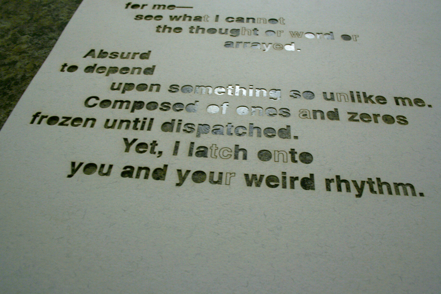
Our investigation for this project centered on asking in what ways can typography act as an interface? We wrote a text of our choosing (in my case, a poem) and then used that text as the content for an interface consisting only of typography. Our aim was to explore the ideas in the text and support them with visual rhetoric.
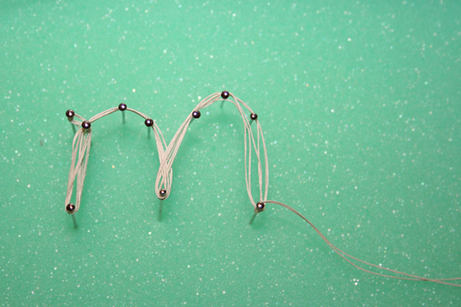
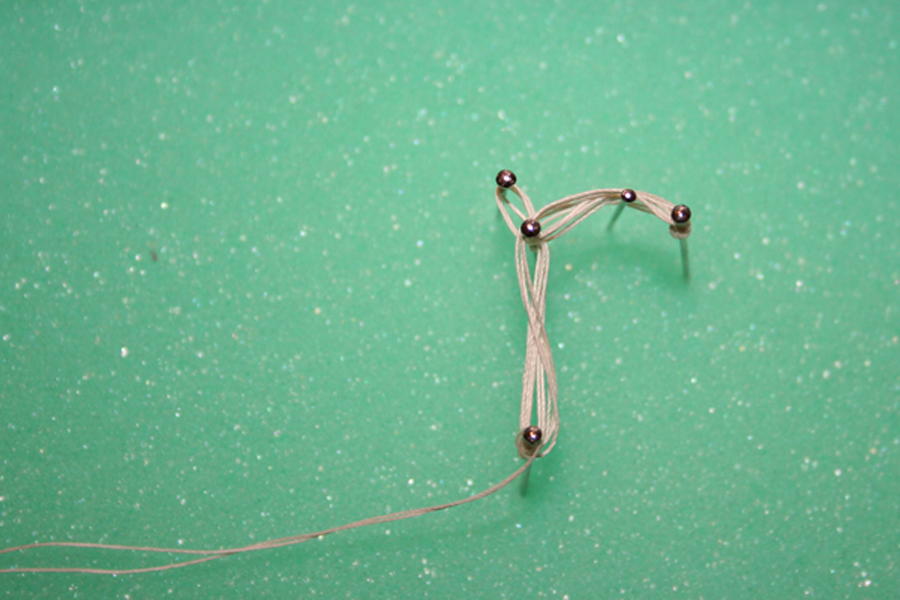
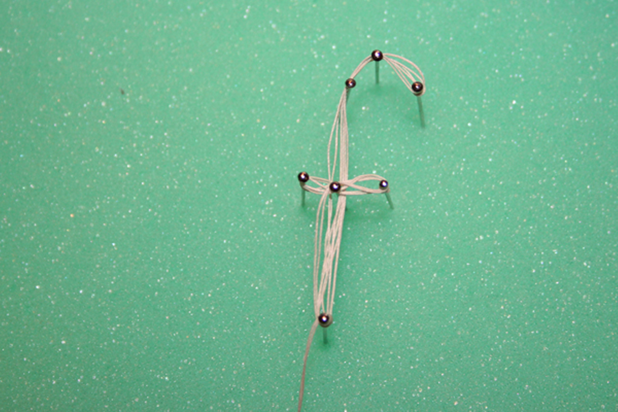
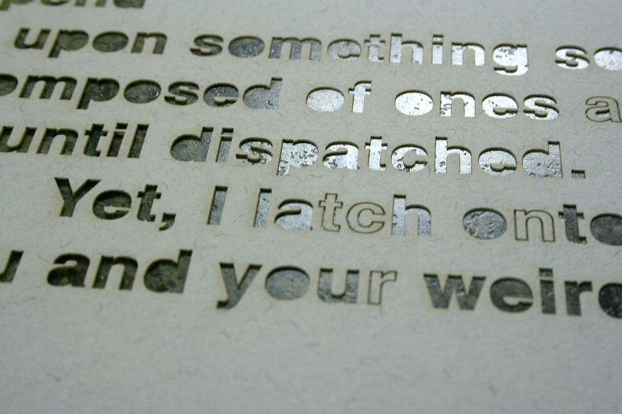
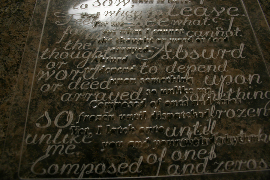
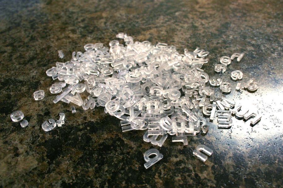
My poem centered around the ambiguous nature of interface, so I decided to explore ambiguity within the materiality of type and the interactivity of an interface. I began with some initial type experiments using pins and thread, and laser cutting plexiglass. These experiments informed the final interface, and the plexiglass type is featured prominently. I wanted to play with light and texture, and create a space that seems tangible and intangible at the same time.
This led me to ask several questions: How might this kind of typography engage or frustrate a user? What are the consequences of purposeful ambiguity? How can experimenting with materials and tools create opportunities for visual exploration and innovation?