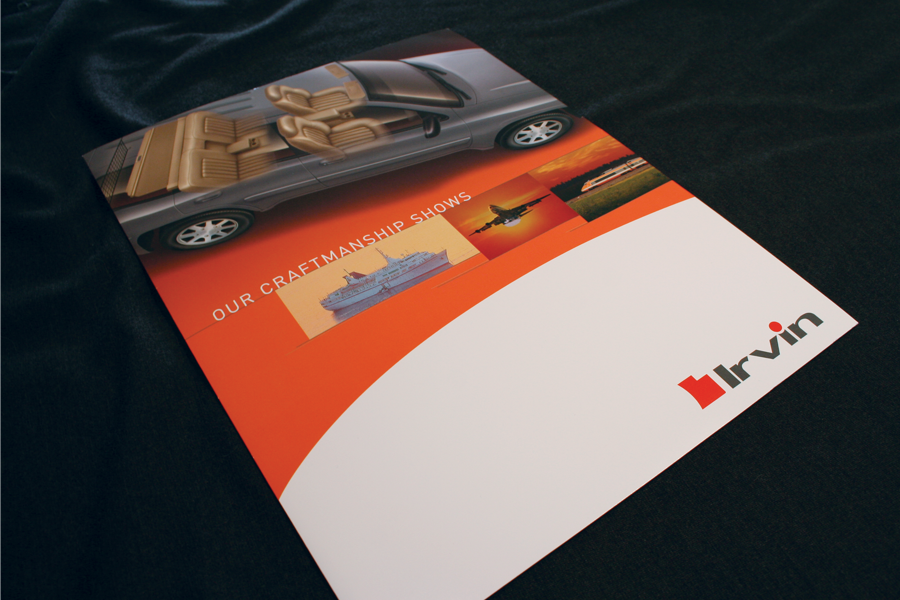
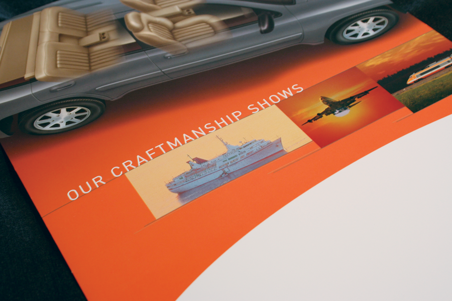
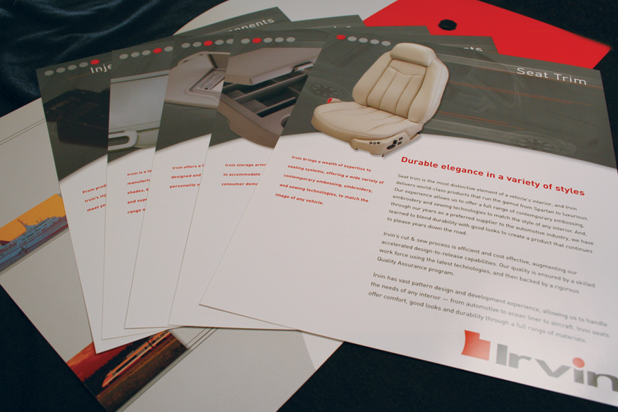
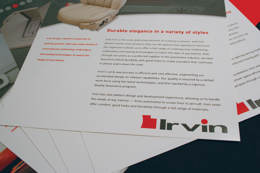
This project entailed working with an illustrator and a product photographer to achieve an overall look of quality. The bold curved white space and the light gray lines were used to convey motion.
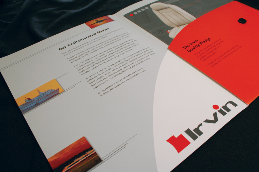
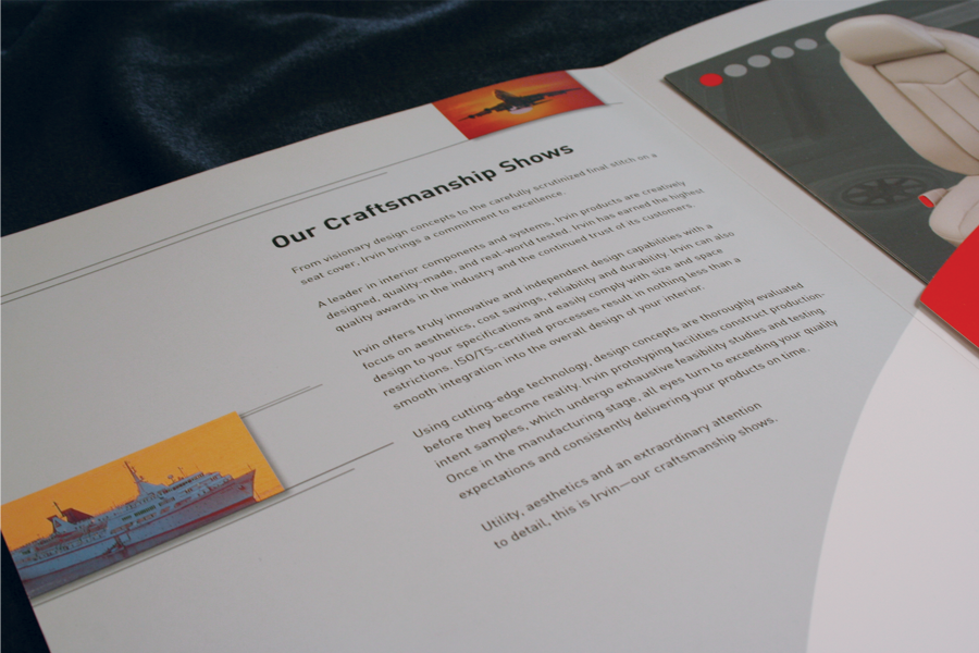
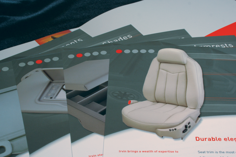
The five inserts were created to highlight the different products that Irvin offers. I used a simple grid to showcase the product photography and organize the information in a logical way. An additional challenge was to create a pleasing and symbolic visual cue to number the inserts—my solution is the gray and orange circles in the upper left corners.